Financial Advisor Redesign
International Insurance Company
The Ask
Design a site that encompasses a financial advisor’s day to day workflow
The Opportunity
Create a Proof-of-Concept prototype that encompasses all of the workflows a financial advisor at the health insurance company might have, while establishing a good client relationship
The Challenge
How do we create these designs in 6 weeks?
How do we facilitate close working ties with developer and client teams?
How do we create an experience that is easy to personalize?
The Team
Four client members that review designs weekly
A developer to provide insight, functionality reviews, and outline
feature requirements
A principal designer to approve all designs for client review and direct design direction
2 senior designers to lead an East and West Coast design teams
to create the experience
I was one of the 4 designers creating wireframes, and part of the
West Coast team
The Process
Each day the West Coast team had four recurring meetings. A morning check in meeting, a daily review with the East Coast team to align designs and then a West Coast check in meeting with the design principal and our partner developer to go over any design details as well as functionality demands. Wrapping up the daily meetings was the check in with the client partner team to make sure that what we did fit in with their demands and what they had envisioned for the experience. Then once a week would be a check in to see how well the design teams were keeping up with the 6-week project timeline, as well as reassessing workload and what features are necessary for the advisor’s workspace. This often led to some features being dropped or merged into other features as designs developed and a greater understanding of how the site would function was established.
Ultimately at the 6-week mark all of the designers came together to present the advisor’s workspace to a larger client team that included stakeholders, to hopefully garner more attention for the project and start establishing the next phase of the project. I was in charge of presenting the settings section of experience and wrap up the presentation before the design principal would field questions.
The Deliverable Gallery
Other than a series of wireframes, the client wanted to get a gauge of how much our team could complete in 6 sprints over a month and a half. To see how many features our team of designers could design and prototype during that period of time.
The features would all be aimed at helping insurance advisors at the company complete their day-to-day tasks and personalize their online workspaces. Ensuring personalization in the prototype was achieved by gathering features into widgets, that could then be expanded, modified, or hidden from the homepage. With more in-depth information delegated to subpages.
LIST OF DELIVERABLES:
7 sections of an Insurance Advisor’s workspace: Homepage, Calendar, Messages,
Book of Business, etc.Desktop High-Fidelity Prototypes
Documentation and up to date sitemap of the prototype experience
HOMEPAGE
The homepage needed to have a small snapshot of a lot of different pieces of information. The East Coast team set up the layout and worked on the majority of the widgets that would appear. However, I was looped in to work on the customization aspect of the homepage.
After deliberation, it was decided that a side drawer would be pulled in from the right side of the screen. This would allow users to either toggle a widget on or off, and also toggle how much information a given widget might show. So that an advisor can make sure only the necessary information is shown, and they aren’t overwhelmed by too much information. The drawer would also the user to drag and drop widgets onto the homepage instead of the basic toggle, so that the advisor can also determine where the widget would sit on the page.After deliberation, it was decided that a side drawer would be pulled in from the right side of the screen. This would allow users to either toggle a widget on or off, and also toggle how much information a given widget might show. So that an advisor can make sure only the necessary information is shown, and they aren’t overwhelmed by too much information. The drawer would also the user to drag and drop widgets onto the homepage instead of the basic toggle, so that the advisor can also determine where the widget would sit on the page.
MESSAGES
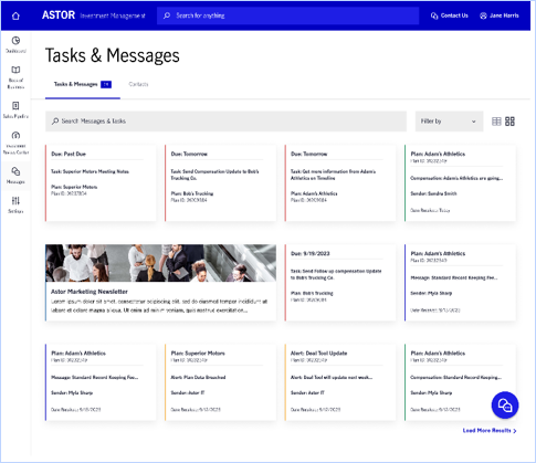
Advisors have lots of communication being sent to them. From tasks, to different types of emails, we were tasked with coming up with a sort of hub for all these messages to live in. While the most obvious choice was to create a grid approach that mimics an email inbox, we were asked to create a different approach to provide an optional view for those who didn’t care for the standard view.
I suggested a card type of view where there would be some sort of indication of what category a message would fall under. This eventually led to the view shown above, where the page title and navigation would be the same for the standard and this card view, and a user is able to switch back to the standard view by selecting a grid icon located to the right of the Filter by dropdown.
MESSAGE PAGE
There are four categories of messages: Task, Marketing, Email (blue), and Alert (Yellow). However, Task could also be broken down into urgency, with red being the most urgent and green the least urgent task.
This color coordination was brought into the expanded page of each of the messages. Each message would have the same sort of structure at the top - capsule indicating the message category, the message title, followed by the message itself. Afterwards, information that is relevant to the message is included, for example tasks would have a deadline date and show any communication between teammates in reference to the task, and marketing messages would make sure to include any links to register for events like webinars.
SETTINGS
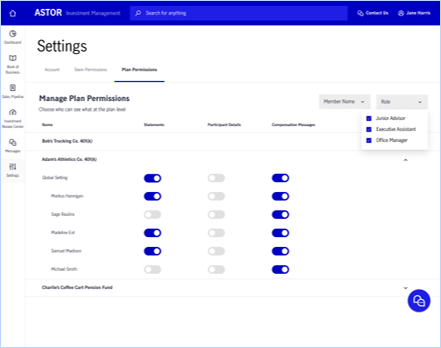
An advisor often times has a lot of projects and with that will have a team that they manage as well. In the Settings section of the website an advisor is able to manage which team members are able to see which projects, and on a more minute level, determine what part of a project that team member can see. This helps an advisor maintain customer privacy and security while ensuring that they have the help they need to get the job done. This was the most pivotal part of the setting experience that I designed, which the other functionality centered on updating their individual profile.
The Conclusion
We as a team, created a prototype that contained 7 sections that contained features to help an Advisor communicate, manage their personalization features, and keep track of their Book of Business.
TAKEAWAY 1
The client desired a lot of features; however, they didn’t fully understand how they wanted the features to work together. Therefore, this project became a task in how to connect incomplete pieces together.
TAKEAWAY 2
There were two teams of designers working with a three-hour time difference, clear communication became key in staying on top of progress, and making sure that no duplicative work happened.
TAKEAWAY 3
Now only did certain features live in multiple sections of the experience, but both teams had to come together to make sure that design practices were consistent between all sections of the experience, and everything linked up together perfectly. Our team of designers had to spend time combing through each other’s designs to make sure that all font weights, color choices, type sizes, and etc. were matching up.


